There’s a moment every year when you pick up the new iPhone Pro and you expect that familiar feeling: cold metal, tight tolerances, that quiet confidence that Apple didn’t just build a phone. They built a thing you’ll keep touching all day.
With the iPhone 16 Pro, that moment was easy. Everything about it felt cohesive. The materials, the finish, the way it sat in your hand, it had that unmistakable “premium object” vibe Apple has been known for.
With the iPhone 17 Pro, the story feels different.
Not because it’s suddenly a “bad” phone. But because it feels like Apple made a series of design decisions that favour practicality and internal engineering over the seamless, luxurious identity the Pro line usually stands for. And once you notice those changes, it’s hard to un see them.
The iPhone 16 Pro Felt Like a Unified Premium Object
The 16 Pro didn’t just look premium, It felt designed with a single visual and tactile philosophy. Its titanium and matte glass identity was clean, confident, and uninterrupted.
The back looked like it belonged to one surface, one story. The edges felt intentional. The overall device had that “crafted” feeling like every curve and finish was chosen as much for emotion as for function.
In everyday use, that matters more than spec sheets ever do. Because your phone is something you touch hundreds of times a day. The 16 Pro rewarded that constant interaction with a kind of quiet satisfaction.

The iPhone 17 Pro Introduces a Design “Split” You Can’t Unsee
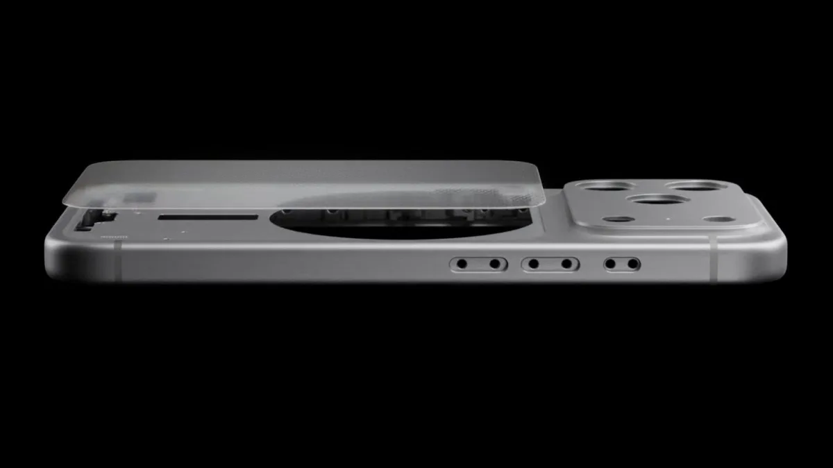
The first thing that changes your perception of the iPhone 17 Pro is what happens on the back.
This time, the design doesn’t feel like one uninterrupted canvas. Instead, the back appears more segmented, almost like the phone is visually “explaining” its internal layout.
And the biggest reason for that? Wireless charging integration.
“We had to carve the back into sections to make the feature work.”
Wireless charging is supposed to feel invisible a convenience feature that fades into the background. But when the design starts showing obvious boundaries or material shifts because of it, the feature stops feeling like magic and starts feeling like a compromise.
A Pro iPhone is supposed to look clean from every angle. With the 17 Pro, the back can come off as more industrial, more engineered, and less “beautiful object.”
It’s not that it looks terrible. It’s that it looks less special.
Aluminium Unibody: Strong Logic, Different Emotion
Apple’s move toward an aluminium unibody approach has a clear rationale. It can help with thermal management, internal space efficiency, and structural simplicity.
On paper, it’s a smart engineering direction.
But emotionally? It changes the personality of the phone.
Titanium carries a certain “Pro” symbolism like rigidity, rarity, that armoured feel. Aluminium, even when well-finished, communicates practicality and production efficiency. It can still be premium, sure but it doesn’t signal premium in the same way titanium does.
So when you come from a 16 Pro and pick up a 17 Pro, the shift doesn’t feel like “this is the next evolution.” It can feel more like “this is the new direction… whether you like it or not.”

The Real Test of Build Quality: How It Ages in Real Life
When people complain about build quality, they’re rarely talking about what happens in a lab.
They’re talking about the first month.
They’re talking about micro scratches, finish wear, scuffs that appear too quickly, and the subtle feeling that the phone isn’t holding onto its “new” look the way the previous one did.
That’s why build quality isn’t just strength, it’s long-term elegance. A Pro phone should look and feel premium even after weeks of pockets, desks, chargers, and daily friction.
With the 17 Pro’s new material choices and more visibly segmented back, it feels like the phone invites more scrutiny. And the more scrutiny a Pro device invites, the less effortless it feels.

Seamlessness vs. Feature-Driven Design
If you zoom out, the iPhone 17 Pro feels like a phone designed from the inside out.
More metal. Less glass. More emphasis on thermals, internals, and structure. And a back design that reflects functional decisions more than aesthetic purity.
None of those are inherently wrong choices.
But they add up to a specific trade-off:
The iPhone 16 Pro prioritised seamlessness.
The iPhone 17 Pro prioritises practical architecture.
And that’s where the “compromise” feeling comes from. Not from a lack of quality but from a shift in what Apple seems to value most in the Pro design language.
So… Did Apple Compromise on Build Quality?
If build quality means engineering, the iPhone 17 Pro may be perfectly defensible.
But if build quality means what most people actually experience, the harmony of materials, the cohesiveness of design, the tactile luxury, the visual elegance. Then yes, it feels like Apple compromised.
The iPhone 16 Pro felt like a premium object first, and a device second.
The iPhone 17 Pro feels like a device first — premium, but more practical than poetic.
And for a Pro model, that shift is exactly the kind of thing you notice the moment you pick it up.


Comments (0)
Join the conversation
No comments yet. Be the first to share your thoughts!